Best Single Kanji for Tattoos: Tokyo-Native Picks
Best single kanji for tattoos chosen by Tokyo natives: 10 picks with authentic meanings, verified translations, and native reader reactions.
Picking from the best single kanji for tattoos sounds simple — one character, how complicated could it be? Plenty, it turns out. A quick search returns endless listicles with pretty characters and poetic descriptions, but none of them tell you what a native Japanese reader will actually think when they see it on your arm. That gap — between "looks right" and "is right" — is where tattoo regret lives.
This guide draws on KIO's Tokyo-native verification work to give you the honest picture: which single kanji earn genuine respect, which ones trip up even careful researchers, and how to make sure your choice holds up before you sit in the chair.
Why Single Kanji Make the Best Tattoos
The visual logic is obvious: one character is clean, bold, immediate. The practical logic runs deeper.
Single kanji sidestep the most common error in kanji tattooing — the compound-word trap. Japanese compounds two and three characters into words whose combined meaning is entirely different from the parts. Choose one character only, and you remove that entire category of risk.
There is also cultural weight behind the choice. Japanese calligraphers have chosen a single character to represent a year, a value, or a personal intention for centuries. The Japan Kanji Aptitude Testing Foundation announces one character every December to represent the national mood — 金 (kin — gold, money) in 2000, 絆 (kizuna — bonds between people) in 2011. A single kanji carries real cultural gravitas in Japan, not just in Western tattoo studios.
The Tokyo-Native Standard: What Makes a Kanji Tattoo Right
Based on thousands of verification requests reviewed by KIO's Tokyo-native team, a kanji tattoo clears our standard when it passes three tests simultaneously.
Test one: is this character used in modern Japanese? It must appear in everyday writing — news, text messages, casual conversation. Archaic or exclusively poetic characters look beautiful but immediately read as "researched from a dictionary, not a living language."
Test two: does the visual rendering hold up? Every kanji is built on a specific stroke count and order. A misplaced stroke — even by a skilled artist — can alter the character. Stroke order matters more than most tattoo clients realize.
Test three: would a Tokyo native choose this character for this meaning? This is the question translation tools cannot answer. Google Translate maps characters to words. It does not tell you whether a character carries the connotation you want, or whether it doubles as something embarrassing in a different compound. Additionally, every kanji has two primary reading systems — kun'yomi (Japanese reading, usually for standalone use) and on'yomi (Sino-Japanese reading, usually in compounds). The correct reading matters for native perception.
The 10 Best Single Kanji for Tattoos
1. 愛 (ai — love, affection)
愛 (ai — love; used for romantic love, parental love, and love of one's country in contemporary Japanese) is the most universally chosen kanji for tattoos outside Japan, and with good reason. It is consistently used in modern Japanese, requires no philosophical framing, and a Tokyo native reading it will see exactly what you intended. Thirteen strokes give it moderate visual complexity that renders cleanly at medium and large sizes.
Compound note: 愛人 (aijin) means mistress in modern Japanese — relevant only if you are considering a multi-character design. A single 愛 carries no trap.
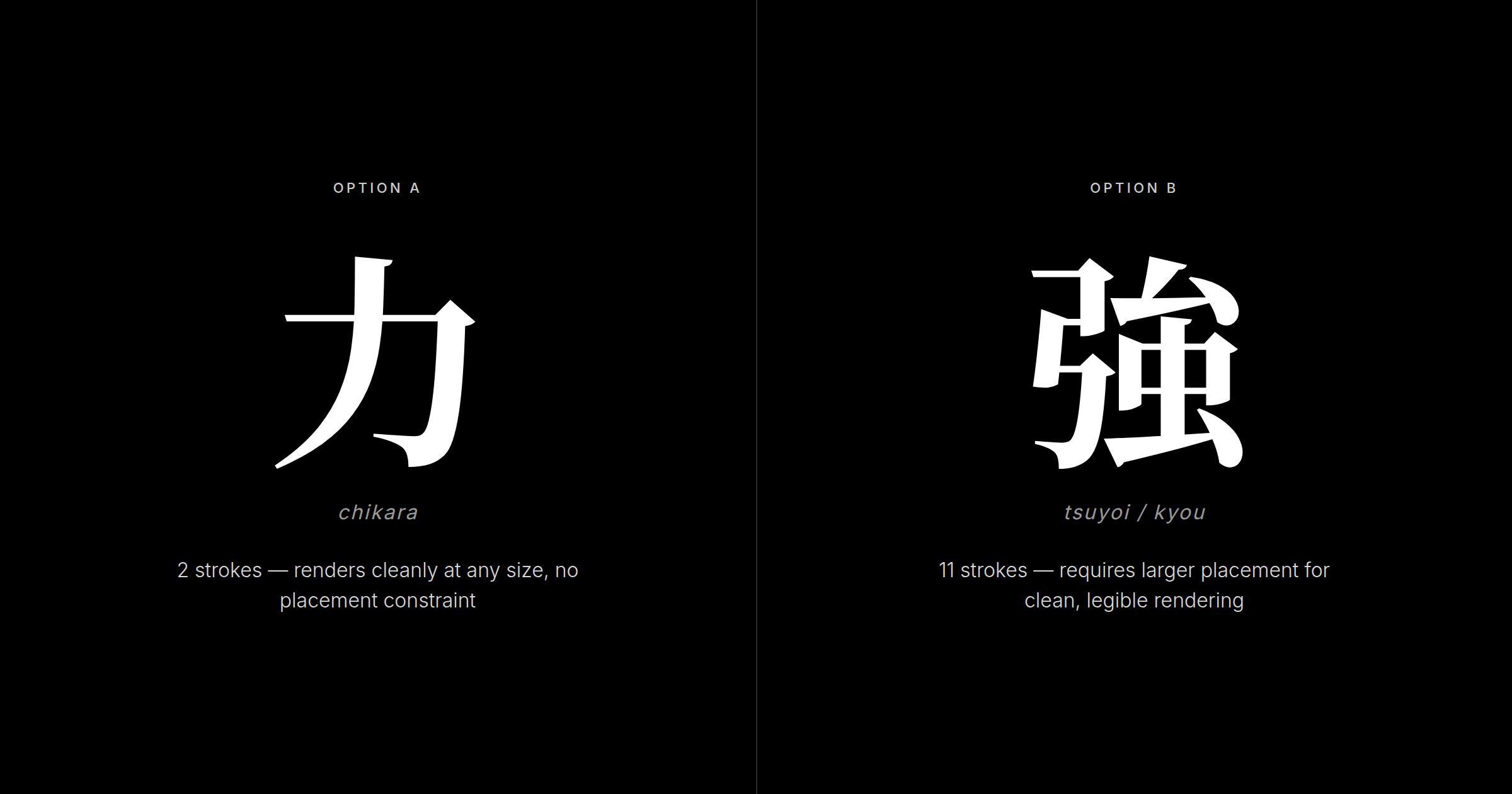
2. 力 (chikara — power, strength)
力 (chikara — power or strength; used in sports commentary, motivational writing, and everyday expressions of effort) is perhaps the boldest argument for minimalism. Two strokes. Immediate visual impact. Zero ambiguity. It renders at almost any size and carries no compound traps as a standalone character.
3. 心 (kokoro — heart, spirit, mind)
心 (kokoro — heart or spirit; refers to the seat of emotions and one's inner world, not just the physical organ) is four strokes of elegant simplicity. It appears across a huge range of modern Japanese writing and holds up at small sizes. If 力 is a declaration, 心 is an introspection — Tokyo natives tend to read it as an emotionally mature choice.
4. 勇 (yuu — courage, bravery)
勇 (yuu — courage; describes bravery under pressure in contexts from sports psychology to personal development writing) strikes a balance between accessibility and depth. Nine strokes, clear structure. Japanese readers associate it with the decision to move forward despite difficulty — the kind of meaning that deepens over time rather than fading.
5. 信 (shin — trust, belief, integrity)
信 (shin — trust or belief; seen in business contexts, relationship vocabulary, and the compound 信頼 shinrai — reliance — one of the most common words for trust in modern Japanese) carries philosophical weight without demanding any spiritual framework. Tokyo natives tend to see 信 as a considered, mature choice.
6. 無 (mu — emptiness, void, nothingness)
無 (mu — emptiness or nothingness; a central concept in Zen Buddhist practice, used to indicate absence, negation, and the state of non-attachment) requires a specific kind of honesty from the wearer. Twelve strokes, visually interesting, with genuine Zen resonance in Japan.
Critical compound note: 無料 (muryou — free of charge) appears on promotional signs across Japan. A single 無 is not a commercial term, but anyone considering 無 in a two-character design should verify carefully.
7. 永 (ei — eternity, always)
永 (ei — eternity; used in formal pledges, poetic writing, and names, with the sense of something continuing without end) is calligraphically significant — it is the character used to teach all eight fundamental brush strokes. Five strokes, elegant proportions. Tokyo natives who recognize that calligraphic significance will see it as a genuinely thoughtful choice.
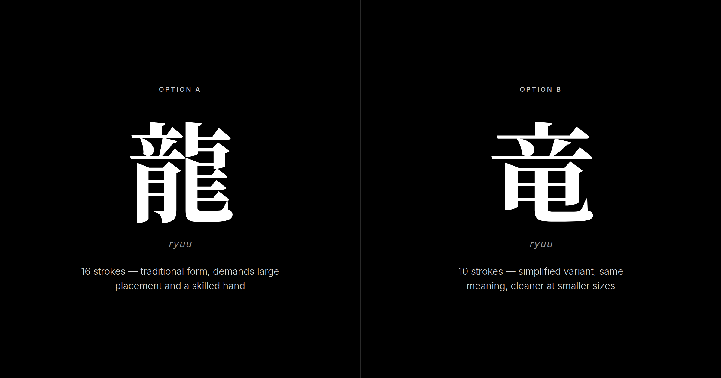
8. 龍 (ryuu — dragon)
龍 (ryuu — dragon; represents power, protection, and wisdom in East Asian tradition — a water deity and symbol of transformation, distinct from the more destructive Western dragon) is the most visually demanding character here. Sixteen strokes. It requires a large placement — back, upper arm, thigh — and a tattoo artist who has rendered Japanese characters before. A simplified form, 竜 (ryū — same dragon at 10 strokes), exists and is used in modern Japanese signage and casual writing, but for a tattoo the traditional 龍 is the stronger choice: its density is what gives the character its weight as a permanent symbol, and Japanese readers read the simplified form as a casual or modernizing register that undercuts the gravity people usually want from a dragon tattoo.
9. 火 (hi / ka — fire, passion)
火 (hi or ka — fire; used metaphorically for passion, anger, energy, and transformation in modern Japanese, and one of the five classical elements) is four strokes of unmistakable visual clarity. Simple enough to render at any size, distinctive enough to carry real meaning.
10. 海 (umi — sea, ocean)
海 (umi — the sea or ocean; carries associations of vastness, freedom, and connection to nature; widely used in personal names, place names, and everyday vocabulary in coastal Japan) is the most lifestyle-specific choice. Nine strokes, clean rendering. If your connection to the ocean is genuine, 海 reads authentically. If you are choosing it because it looked interesting in a search result, that gap between intention and authenticity will show to a native reader.
Characters That Look Right but Fail Verification
These are not obvious translation failures. They are characters or combinations that appear meaningful but carry unintended readings.
七輪 (shichirin) — some dictionary tools suggest a "seven rings" or spiritual reading. In modern Japanese, this is a small charcoal grill used for tabletop cooking. Barbecue equipment, permanently tattooed.
痛風 (tsuufuu) — reads to a beginner as involving pain and wind, which sounds intense. In Japanese, this is the clinical term for gout. No individual character signals the problem; only native familiarity with medical vocabulary catches it.
無料 (muryou) — "free" and "nothing" as components, which some interpret as a spiritual statement. In Japan, this is the word on free samples and no-cost promotions. Commercial language, not philosophy.
抹茶 (matcha) — appears meaningful as "ground" + "tea," which sounds like a wellness concept. In reality, matcha is a simple product descriptor for powdered tea, carrying no symbolic or philosophical depth. The matcha kanji tattoo article breaks down exactly why this compound conceals its functional meaning so effectively.
Similarly, 金継ぎ (kintsugi) — the pottery repair technique — carries philosophical weight in Western wellness culture but reads to Japanese readers as a craft label, not a philosophy. The characters are technically correct, but they convey the function of mending broken ceramics, not the deeper ideas of impermanence and acceptance many Westerners associate with the concept. The kintsugi tattoo kanji article explores how this philosophy-to-craft gap creates the expectation mismatch.

Understanding the compound-trap mechanism is what separates a well-researched tattoo from one you will regret. How to recognize common kanji tattoo errors covers this in depth. The inverse error also exists: single characters promoted as complete when they only function within compounds—the TikTok aura kanji trend being the canonical example. If you discover after inking that your kanji means something else, we have options covered in our removal and cover-up guide.
How to Verify Your Kanji Before Getting It Tattooed
Three questions that matter most when verifying with a native speaker:
One: is this how a Tokyo native would naturally write this concept? Not "does this character exist" — everything in a dictionary exists. The question is whether a native reaches for this character in contemporary writing.
Two: are there any compounds that use this character in a way that would make a Japanese reader pause? A single 愛 is fine; 愛人 is not. A single 無 is fine; 無料 is not. Your verifier should walk through the common compounds.
Three: does the stroke rendering in your design match the correct form? A photo of your planned design, checked against the standard character, is worth more than a thousand dictionary lookups.
Your Japanese-learning friend — even a fluent one — may not catch everything here. Compound-word awareness is built from years of reading native text. A structured approach to verifying your kanji tattoo before getting it covers the full framework.
Stroke Count and Visual Balance
Stroke count sets real constraints on placement and size — there is no universal right answer.
Characters with two to five strokes — 力, 心, 火, 永 — render cleanly at almost any size, including wrist, collarbone, or behind an ear. Their simplicity means an artist with limited kanji experience is less likely to introduce errors.
Characters with nine to thirteen strokes — 愛, 信, 勇, 海, 無 — require medium to large placements. At small sizes, stroke intersections blur first, which can affect legibility as the tattoo ages.
龍 at sixteen strokes is a commitment to scale. Back, upper arm, or thigh only — anywhere the artist has room to get every stroke right. Style matters too: brush-style kanji (the traditional calligraphic form) read as intentional and culturally grounded. Block or digital-font kanji look mechanical and, to many native readers, slightly incongruous as body art. For detailed guidance on how body location, size, and orientation work together — and how to match placement to the weight of your chosen meaning — see the complete guide to kanji tattoo placement, size, and direction. Important note: Japanese kanji differ from Chinese hanzi in stroke count and form — if your artist is unfamiliar with these distinctions, learn the differences before committing to a design.
Native Verdict
What a Tokyo reader actually sees — and what it tells them about you.
When someone with a kanji tattoo walks into a room in Tokyo, the assessment happens in three to five seconds. It is not conscious judgment; it is the automatic processing of a fluent reader. The character resolves, the meaning registers, the reaction follows.
If the character is correct and clearly rendered, the reaction is quiet approval. 心, 愛, 勇 — these are words that appear in Japanese daily life, not just in foreign tattoo studios. Seeing them correctly rendered signals that you took the language seriously. That signal matters more than people expect.
If the character is wrong — a missing stroke, a compound trap, a translation error — the reaction is not offense. In our experience reviewing hundreds of kanji tattoo cases, Japanese people do not feel their culture is being violated by an incorrect character. The reaction is closer to gentle amusement, similar to how you might feel seeing a foreigner's T-shirt with broken English. The intent is sympathetic; the execution missed.
The critical insight: Japanese people do not penalize foreigners for getting kanji tattoos. They assess whether you took the language seriously. Correct execution is how you demonstrate that you did. Younger generations in Tokyo — those in their twenties and thirties — react with more warmth and curiosity than older ones, and a well-chosen character often sparks genuine interest in what it means to the wearer.
One historical note: traditional Japanese tattooing (irezumi) carries associations with yakuza culture among older generations. A single kanji tattoo on a foreigner is read entirely differently — it is not associated with that tradition and does not carry those connotations. For the full picture on Japanese perceptions, what Japanese people really think about kanji tattoos covers the range of responses in detail.
FAQ
What's the best single kanji for a first tattoo?
For a first tattoo, prioritize low stroke counts, unambiguous modern meanings, and no compound-word traps. 力 (chikara — strength, 2 strokes), 心 (kokoro — heart, 4 strokes), and 愛 (ai — love, 13 strokes) are the most consistently approved choices in KIO's verification work. "Best" is personal — a character central to your life will age better than a popular one chosen for appearance. For a case study in how anime creators select kanji thoughtfully, the Demon Slayer kanji breakdown shows characters like 滅 and 鬼 that carry genuine cultural weight beyond fandom appeal.
Can a single kanji tattoo have the wrong meaning?
Yes, through three mechanisms: a translation tool returning the wrong character, stroke errors in rendering, or choosing a character with the wrong register for your intent. Ariana Grande's widely reported 2019 tattoo — intended to read "7 rings" but reading differently due to an omitted character — is the most documented public example. Native verification before inking is the only reliable safeguard.
How do I know if my single kanji choice is authentic?
Ask three questions: Would a native speaker reach for this character in contemporary writing? Does it carry compound meanings that contradict the intention? Does your design match the correct stroke form — not a stylized variant? A speaker who grew up reading Japanese catches things a learner may miss. Professional verification is the cleanest path to confidence.
What do Japanese people think when they see a single kanji tattoo on a foreigner?
Initial curiosity, then a quick accuracy check. A correct character earns quiet appreciation — a sense that you took the language seriously. An incorrect one produces mild amusement, not offense. Japanese people, particularly younger generations in Tokyo, do not consider kanji tattoos on foreigners to be cultural appropriation. The assessment is entirely about accuracy. Getting it right signals respect; getting it wrong signals haste.
Is it OK to get a popular kanji like 愛 even though many people have it?
Yes, if it is genuinely meaningful to you. Popularity does not undermine authenticity. Tokyo natives do not penalize you for choosing 愛; they respect the care you took in getting it right. The desire to be original by choosing an obscure character can backfire — an unusual character may raise questions about whether you researched it carefully, whereas 愛 or 心 read as deliberately chosen. Meaning is the anchor; uniqueness is secondary.
How many strokes should a kanji tattoo have?
There is no fixed rule, but stroke count shapes placement options. Two to five strokes (力, 心, 火, 永) work at almost any size. Nine to thirteen strokes (愛, 信, 勇, 海) need medium or large placements to stay legible as the tattoo ages. Sixteen or more strokes (龍) require large placements and an artist experienced with Japanese characters. Higher stroke counts also mean misplaced strokes are harder to catch at the design-approval stage.
Should I choose a kanji based on how it looks or what it means?
Meaning first, aesthetics second — without exception. A character chosen for visual shape alone carries no emotional anchor and is more likely to feel hollow over time. Tokyo natives notice: a character worn because it resonates reads as intentional; one picked for appearance reads as decoration. Start with the concept you want permanently, verify the most natural character in modern Japanese, then work with your artist on the rendering. For a deeper framework on choosing meaningful kanji, see our dedicated guide to making authentic selections that last.
Ready to confirm your choice before the appointment? Verify your kanji at Kanji Ink Oracle — KIO's Tokyo-native reviewers assess your character, check stroke rendering, and flag any compound-word risks, with results returned within 24 hours.