Kanji Tattoo Placement: Size, Direction, and Body Location
Where you place a kanji tattoo matters as much as the kanji itself. Size, direction, and body location shape meaning — guidance from Tokyo tattoo culture.
You've chosen a kanji you believe in. You've verified the meaning. Now comes the question most guides skip: kanji tattoo placement — where it goes on your body, how large, and which way it reads. These aren't decorating decisions — they're the final layer of meaning that turns a correct kanji into a culturally coherent tattoo.
Collectors who have done their research tend to feel the anxiety here most acutely: they know enough to know these choices matter, but not enough to feel certain about what "right" looks like. This guide exists for that reader.
Why Kanji Placement Matters More Than You Think
In Japanese visual culture, where you wear a kanji carries social and aesthetic weight. A strength kanji 強 (kyou — strong, resilient; the character appears in sports contexts, formal declarations of resolve, and everyday language about difficulty) sized boldly across your upper back reads as a deliberate life statement. The same character, two centimeters tall on your inner wrist, reads as something you're not quite sure about yet.
This isn't a judgment about timidity — it's about coherence. Japanese observers pick up on whether placement matches the claimed depth of meaning. A major philosophical concept tucked in a corner signals that the wearer knows the kanji is meaningful but hasn't fully committed to it.
Western collectors typically approach tattoo placement as a surface-fitting problem: which body part is flat enough, visible enough, the right size? Japanese collectors and artists approach it in reverse: what does this kanji represent, what emotional register does it occupy, and where on the body does that register belong?
Based on thousands of verification requests reviewed by KIO's Tokyo-native team, the most common placement mistakes come not from bad taste but from starting the decision backwards — finding a spot on the body first, then shrinking the kanji to fit, without ever asking whether that location honors the meaning.
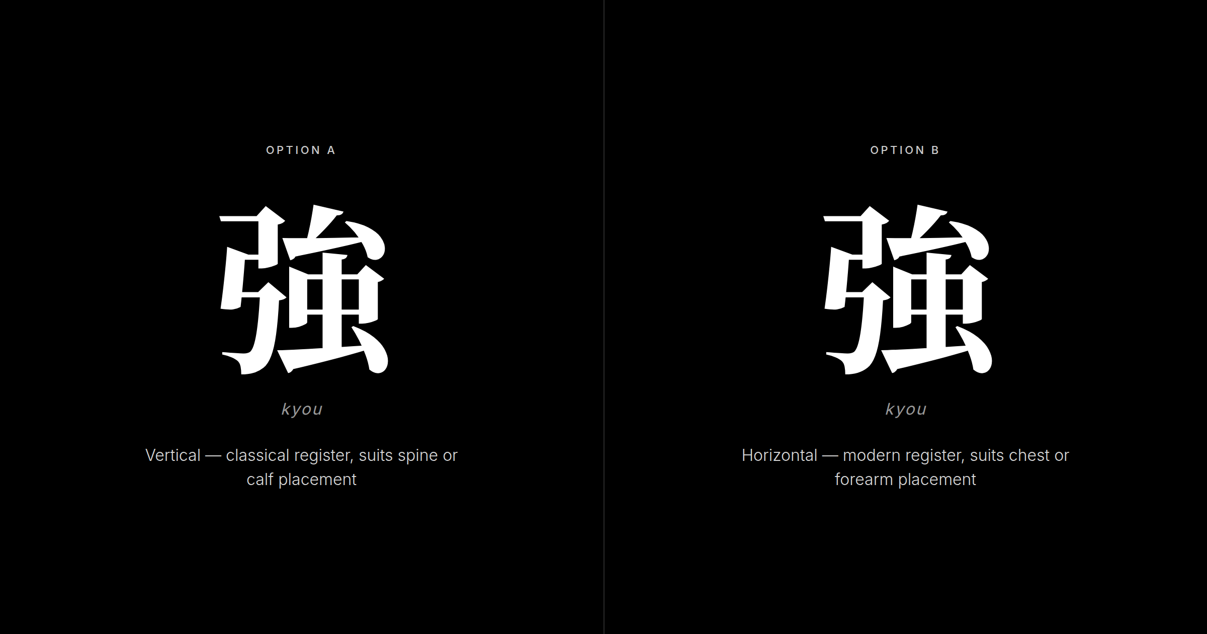
Reading Direction: Vertical vs. Horizontal
Japanese text flows vertically in traditional and formal contexts — classical literature, newspapers, formal correspondence. It flows horizontally in modern and casual contexts — websites, product packaging, text messages. Both are correct Japanese. They carry different registers.
Vertical (tate-gumi, 縦組み) reads top-to-bottom. It suits formal or weighty kanji, traditional artistic styles, and body areas where the natural line runs lengthwise — the spine, the calf, the side of the neck. Japanese observers read vertical kanji placement as deliberate and rooted in tradition.
Horizontal (yoko-gumi, 横組み) reads left-to-right. It suits contemporary designs, casual registers, and body areas that open horizontally — the chest, the shoulder, across the forearm. Japanese observers read horizontal kanji placement as modern and self-aware; the wearer is engaging with kanji as living language rather than historical artifact.
Neither reading direction is more "authentic." But horizontal on a forearm and vertical on a spine each feel compositionally natural in ways the opposite choice does not.
The Body Placement Map
Each body area carries its own constraints around size, healing, and cultural legibility.
Upper back and spine: The prestige placement for serious collectors. The large, flat surface supports 4–6 inches for a single kanji or vertical phrase. Vertical orientation reads naturally along the spine. This area heals cleanly, stays protected from sun exposure, and ages well with minimal distortion.
Chest: Intimate and personal. The flat sternum area suits horizontal orientation and handles 3–5 inches comfortably. Kanji placed close to the sternum reads to Japanese observers as a private declaration — something held rather than displayed. Strong for kanji related to love, family, or personal conviction.
Forearm (outer): The most versatile collector placement. Flat, low-stretch, medium-sized — the outer forearm accommodates 2.5–3 inches in either orientation and heals reliably. This is the placement where both classical and modern kanji work well.
Calf and shin: Underrated by first-time collectors but well-regarded among veterans. The calf's long vertical surface suits multi-character phrases, heals cleanly, and provides collector-style privacy — visible when you want it to be, otherwise not.
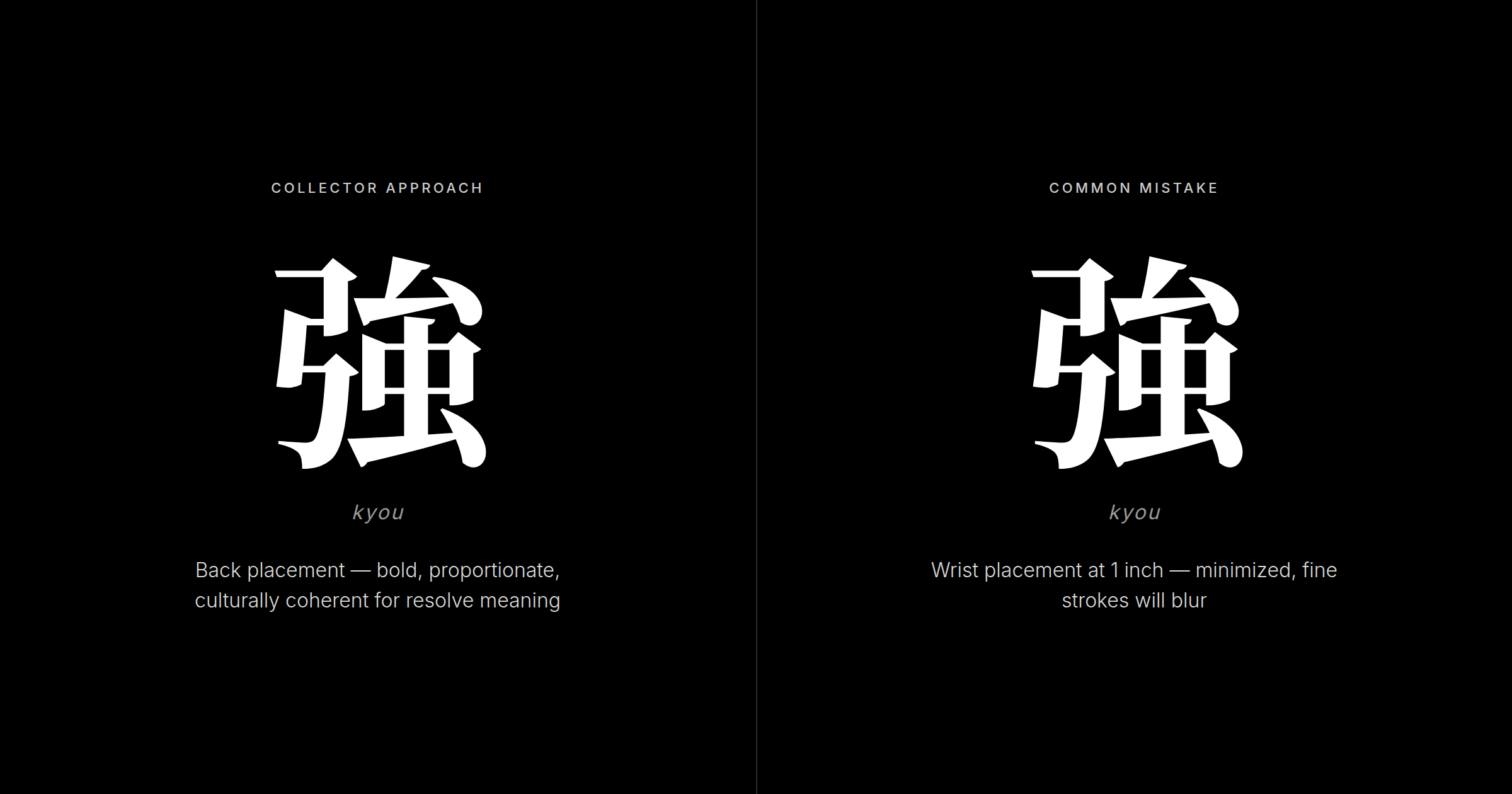
Wrist and ankle: High-movement areas with limited real estate. Single kanji only, minimum 1.5 inches. These joints flex constantly, extending healing time and increasing blurring risk. Bold kanji with low stroke counts work here; complex characters do not. 力 (chikara — power, physical or moral force; common in athletic and motivational contexts) holds up at small scale; a densely stroked character will not.
Shoulder and deltoid: The curved surface means strokes laid straight in the stencil will appear to bend on skin. Sizing must increase 20–30% to compensate. Request a curved-surface mockup, not just a flat digital proof.
Ribs: Aesthetically popular but practically difficult. Rib skin moves constantly with breathing, complicating healing. Weight fluctuations can distort characters placed here over time. Collectors committed to rib placement should size generously and choose bold, simple strokes.
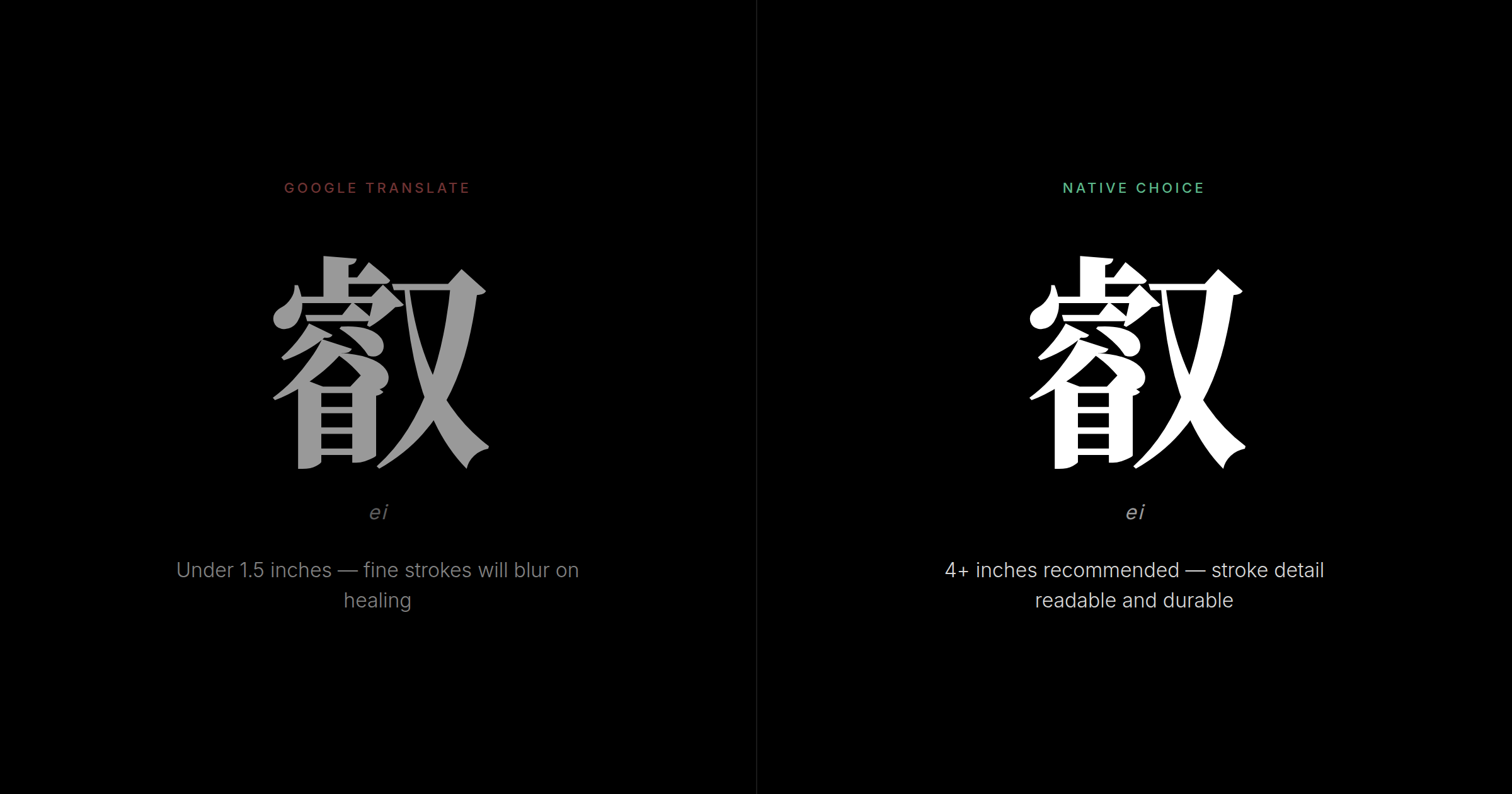
Size: Readability, Healing, and Longevity
Getting kanji tattoo size right is where the most preventable mistakes happen.
- Single kanji: 1.5–2 inches (4–5 cm) minimum; 2–3 inches (5–7.5 cm) recommended sweet spot
- Two-character compound: 3–4 inches (7.5–10 cm)
- Three or more characters: 4–6 inches (10–15 cm)
Complex kanji with 16 or more strokes need at least 4 inches to render stroke detail. Simple kanji with 3–5 strokes can work at 2 inches. Anything under 1.5 inches on skin that moves invites healing blur that is impossible to reverse.
When in doubt, size up by half an inch. The cost of going slightly larger is proportional appearance. The cost of going too small is permanent.
Cultural Placement Conventions Westerners Often Miss
Strength and resolve kanji near the body's core: 強 (kyou) and 力 (chikara) appear more often on chest and back in Japanese tattoo culture than on arms. Western gym culture defaults to the bicep for strength imagery, but Japanese collectors tend to place these characters near the body's center. The cultural logic is that strength isn't just an attribute displayed outward — it's something carried at your center.
Formal kanji placed quietly: Characters with official or institutional weight — those used in government documents or formal ceremonies — feel dissonant when placed loudly on a bicep. The same character on the chest or back reads with more cultural coherence.
Gang and criminal association awareness: Certain full-body configurations and specific character combinations are historically associated with organized crime in Japan. This is rarely a risk with single meaningful kanji, but collectors planning large back pieces or multi-character work should research this and discuss it with a knowledgeable artist. The guide to working with a Japanese tattoo artist covers this territory in more detail.
The Pre-Ink Placement Decision Framework
The correct order of decisions is:
- Identify the kanji and verify its meaning and cultural register
- Choose the tone: classical and formal, or modern and personal?
- Choose body placement that matches that tone: back and chest for weight, forearm for visibility, calf for privacy
- Determine orientation: vertical for classical placements, horizontal for modern ones
- Set size based on placement constraints and character complexity
The backwards version — "I want it on my forearm, what kanji fits there?" — produces placements that feel correct aesthetically but miss the cultural coherence that distinguishes a collector's piece from an impulsive decision.
Before finalizing your kanji tattoo placement choice, apply a simple check: does the kanji's meaning match the visibility you're choosing? A kanji about private grief placed visibly on your forearm reads differently than the same kanji on your ribcage. A kanji about strength placed discreetly on your ankle reads as uncertain about that strength. These are choices you'll wear for decades — make them consciously.
Collectors planning future additions should think about negative space now. A single kanji centered on your upper back leaves no room for expansion. Starting on the calf or off-center on the back creates room for the vertical panel or sleeve you may want later. The artists recommended in our Japanese tattoo artist guide can discuss long-term composition during your consultation.
Working with Your Artist on Placement
An artist's aesthetic skill does not guarantee knowledge of kanji cultural logic. Come prepared with:
- Reference images of the kanji at similar body placements
- A clear orientation preference (vertical or horizontal) and your reason for it
- A sizing minimum based on the guidelines above — and the willingness to hold that minimum if the artist wants to reduce it to fit
- Questions about curved-surface compensation if your placement involves the shoulder or ribs
Ask specifically about their process for kanji verification. If they can't address character accuracy, verify your kanji independently before the appointment so you're not relying on the artist for cultural accuracy.
A red flag worth naming: any artist who says orientation doesn't matter is telling you they haven't thought about the cultural register of vertical versus horizontal Japanese text. The placement conversation is also where your artist should understand what your chosen stroke order and structural decisions communicate — the best kanji artists think at that level of detail.
Native Verdict
What Tokyo tattoo artists actually observe about Western kanji tattoo placement comes down to two patterns, and the gap between them is easy to see at a glance.
Collectors who have thought through placement size boldly. They put weight-bearing meanings — strength, endurance, conviction — on the back or chest, where those meanings have physical and cultural gravity. They choose orientation deliberately and can explain why. When they use vertical, they mean classical depth. When they use horizontal, they mean modern confidence. Placement and meaning belong to the same decision.
Collectors who left placement as an afterthought are also recognizable: tiny philosophical concepts on wrists; complex characters at sizes that blur within a year; curved placements that distort characters mid-stroke. These collectors often know the kanji's translation but haven't considered what it looks like to wear that meaning with or without cultural coherence.
Japanese observers don't grade Westerners on this — there is no cultural gate to pass. But the kanji tattoo placement tells a story about how the wearer arrived at their choice. Confident sizing on a flat, central surface signals someone who sat with their decision. A miniaturized kanji squeezed onto a high-movement area signals someone who wanted the meaning but wasn't quite ready to commit to it.
Match the weight of your placement to the weight of your meaning. Size up rather than down. Choose flat over curved where possible. Make the orientation choice intentionally, not by default. These decisions are legible to anyone who knows how to read them.
Frequently Asked Questions
Can I get a kanji tattoo on my wrist or ankle, or is it too small?
Yes, but with constraints. Single kanji only, minimum 1.5–2 inches. Below 1 inch, fine strokes spread and merge during healing. Wrists and ankles flex constantly, extending healing time and raising blurring risk. Bold kanji with low stroke counts work here; complex characters do not. For collectors prioritizing legibility and longevity, the outer forearm is a safer alternative that still reads as personal.
Should my kanji tattoo be vertical or horizontal?
Neither is culturally wrong. Vertical reads top-to-bottom, matching classical Japanese text tradition — suits back, spine, and calf, signals formal or traditional intent. Horizontal reads left-to-right, matching modern Japanese — suits chest and forearm, signals contemporary engagement with the language. Choose based on the meaning's register, the placement's natural line, and your aesthetic. There is no cultural penalty for either choice.
Where do Japanese people place kanji tattoos?
Upper back and chest are most common for meaningful kanji in Japanese tattoo culture. The upper back suits strength and wisdom meanings; the chest suits intimate, personal declarations. Forearm and calf are also popular. Tiny wrist or ankle placements are less typical in Japan — Japanese collectors tend to size boldly. Curved areas like the shoulder or ribs are less common; flat surfaces are preferred for clean, undistorted lines.
How large should a kanji tattoo be?
Single kanji: 2–3 inches (5–7.5 cm) is the recommended sweet spot. Two-character compounds: 3–4 inches (7.5–10 cm). Three or more characters: 4–6 inches (10–15 cm). Never go below 1.5 inches — fine strokes blur during healing. Complex characters with 16 or more strokes need at least 4 inches to preserve stroke detail. Collectors planning future additions should size their first piece with expansion in mind.
Does placement affect the meaning or cultural respect of my kanji tattoo?
Placement does not alter the kanji's literal meaning, but it broadcasts your relationship to that meaning. Back and chest signal serious, considered intent. Small or hidden placements signal private or minimalist intent. Mismatched placement — a major philosophical kanji tiny on an ankle — reads to Japanese observers as a disconnect between claimed meaning and actual commitment.
What body areas heal a kanji tattoo best?
Flat, low-movement areas heal most cleanly: upper back, chest, outer forearm, and calf are the most reliable. Curved areas like shoulders and ribs experience more movement during healing, increasing blur risk. High-movement joints like wrists and ankles extend healing time. Collectors prioritizing longevity typically choose upper back or calf.
Can my kanji be oriented to read toward my heart rather than outward?
Yes. Orienting vertical kanji so it reads downward toward the sternum gives it an introspective, personal quality; outward-facing orientation signals a public statement. This is not a codified rule in Japanese culture, but the distinction is recognized. Discuss this intention with your artist during placement mockup — it affects final positioning by an inch or more and needs to be deliberate.
Will my kanji tattoo distort over time?
Potentially, depending on placement. Flat areas — upper back, outer forearm, calf — age most cleanly. Rib and inner arm placements are most vulnerable to distortion from weight fluctuation; changes of 20 or more pounds can warp rib-area characters noticeably. Collectors prioritizing longevity choose upper back or calf.
Should the kanji style match the placement?
Yes. Formal calligraphic styles suit traditional placements — back, chest, vertical orientation. Casual brush-script styles match modern placements — forearm, horizontal. Print or block characters suit smaller placements where fine calligraphic variation would be lost. Style and placement should reinforce the same cultural register: formal-to-formal, casual-to-casual.
Can I plan my first kanji placement for future additions?
Absolutely. Centering a single kanji on the upper back leaves no room for a vertical phrase or panel later. Off-center first placement, or starting on the calf or forearm, creates expansion room. The collectors with the most cohesive finished pieces planned their initial placement with a compositional future in mind, not just a current preference.
If you want to carry a kanji that means something real, placement deserves the same care as the character selection. Verify your kanji at Kanji Ink Oracle before your appointment — our Tokyo-native reviewers assess both character accuracy and cultural context, so you go into your session with full confidence in what you're putting on your body.