Attack on Titan Kanji Tattoo: 自由 Meaning
Attack on Titan's 自由 (jiyuu) means freedom as self-directed will, not vague inspiration. Tokyo natives explain what 自由 and 戦え truly mean in Japanese.
Attack on Titan has become one of the defining cultural exports of the 2010s — a show about walls, titans, and the human hunger for freedom. At its heart is a single word: 自由 (jiyuu — freedom). For millions of fans, that word has moved off the screen and onto skin.
This guide covers what 自由 and 戦え actually mean in Japanese — not as anime references, but as living words carrying real weight in Japan today.
Attack on Titan and the Language of Freedom
進撃の巨人 (Shingeki no Kyojin) began serialization in 2009 and ended in 2021. The English title "Attack on Titan" is globally recognized, but Japanese audiences know Shingeki no Kyojin's linguistic texture: 進撃 (advance, charge) combined with 巨人 (giant) creates an urgent, militaristic phrase.
But the soul of the series is not the monsters. It is 自由 — freedom. The Survey Corps, the elite military unit that fights beyond the walls, carries the "Wings of Freedom" emblem: 自由の翼 (Jiyuu no Tsubasa). Every major character arc, every impossible decision Eren Yeager makes, and every sacrifice the scouts accept is framed through this lens. Freedom is not an abstract value in the series; it is the thing people literally die for.
The show's treatment of freedom is unusually nuanced for a mainstream anime. It depicts freedom not as unlimited individual license, but as something won through cost, defined by what you lose to gain it, and complicated by the violence required to hold it. That philosophical weight is exactly why 自由 works so powerfully as a tattoo — it carries the show's moral complexity in two characters.
When Attack on Titan reached Western audiences, it triggered tattoo interest at a scale comparable to Naruto's 愛 (ai — love) on Gaara's forehead. The parallel is instructive: like Naruto kanji tattoos, Attack on Titan fans are choosing words with deep anime resonance — but those words exist in real Japanese, and a Tokyo native reading them brings no anime context at all.
The Kanji Breakdown: 自由 and 戦え
自由 (Jiyuu — Freedom)
自由 is a two-character compound. Each component:
- 自 (ji — self, oneself; used in words like 自分 jibun, "oneself" and 自然 shizen, "nature")
- 由 (yuu — reason, cause, from, by way of; appears in 理由 riyuu, "reason" and 由来 yurai, "origin/history")
Together, 自由 means "from oneself" or "by one's own reason" — more precise than English "freedom." It is not the absence of constraint but the presence of self-directed will.
Here is the critical cultural note: 自由 is not an ancient Japanese virtue. It was coined during the Meiji Restoration (1868–1912) to translate "liberty" from Western philosophy. In modern Japan, 自由 is everywhere — job listings, government discourse, casual conversation. It is not rare, archaic, or ceremonial. It is an active, mainstream word with full modern currency.
For tattoo wearers: 自由 reads clearly to any Japanese person of any age. There is no register problem — neither too casual nor too formal. A Japanese commuter sees it as clean, correct "freedom" — interesting without being strange.
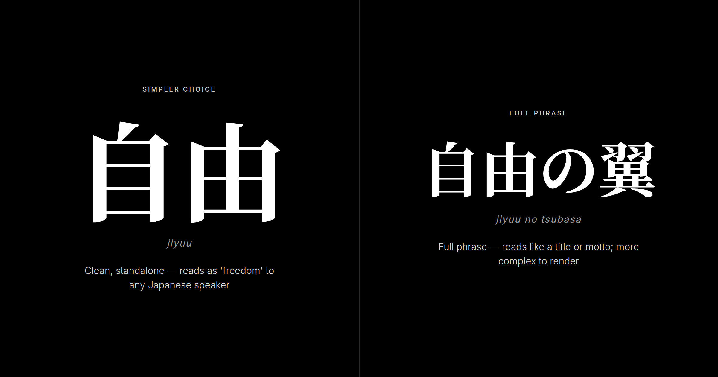
For Attack on Titan fans, the practical design question is whether to use 自由 alone or the full show phrase 自由の翼 — the comparison below shows both at tattoo scale.
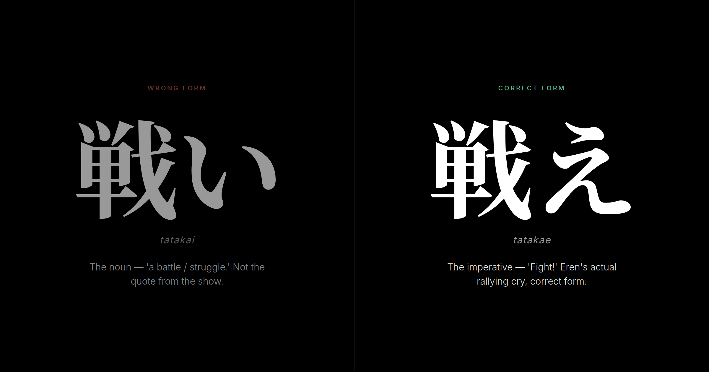
戦え (Tatakae — Fight! / Keep Fighting!)
戦え is the imperative form of the verb 戦う (tatakau — to fight, to battle). The conjugation matters enormously:
- 戦う (tatakau) — the dictionary form, "to fight"
- 戦い (tatakai) — the noun form, "a fight / battle / struggle"
- 戦え (tatakae) — the imperative form: "Fight!" or "Keep fighting!"
Tatakae is a command — specifically, the plain imperative, which in Japanese is forceful and direct. Most Western fans confuse it with tatakai (the noun "battle"), but tatakae is one syllable and one register away. Eren's repeated "tatakae" is not a description of fighting but an instruction to continue when stopping feels easier.
In Japanese, the plain imperative appears in motivational sports contexts and personal rallying cries. A Japanese reader seeing 戦え without anime context would read it as someone talking themselves through something hard. That is exactly what it is.
The Tattoo Pivot: What Happens When You Put This on Your Skin
The distinction matters because it changes the verdict. 自由 is not "freedom" as a vague poster word — it carries specific history and philosophical precision. 戦え is not "battle" but an imperative command, Eren's grammar compressed into one character. A Tokyo native will know both meanings. That knowledge is the whole question.
Native Verdict: What a Japanese Reader Actually Sees
Based on thousands of verification requests reviewed by KIO's Tokyo-native team, the picture for Attack on Titan kanji breaks down clearly:
For 自由: This is about as safe as kanji tattoos get. A Japanese person will read it as a clean, serious statement and will not assume it's from anime — 自由 is too mainstream. The register is neutral: it works in every context without irony or ambiguity. If you want the Attack on Titan theme without announcing the reference, 自由 achieves that perfectly.
For 戦え: This reads more specifically. Fans will recognize the reference; non-fans will read it as a motivational command. The risk is not meaning but execution. The character 戦 has thirteen strokes and requires precision work. A stroke error produces a character that looks wrong to any native reader.
For 自由の翼 (the full phrase): This reads as a title or motto more than a personal statement. It feels more like a slogan than a values statement and is harder to render cleanly at tattoo scale.
The universal caution: As with Demon Slayer kanji tattoos, wrong strokes are worse than wrong kanji. A malformed character suggests carelessness. If a Japanese person cannot read your tattoo, they feel secondhand embarrassment on your behalf. Avoid that reading.
For a full picture of how Japanese people actually process kanji tattoos on foreigners, the Japanese reaction to kanji tattoos guide covers the realistic spectrum — from polite indifference to genuine appreciation.
Design Considerations and What to Avoid
For 自由, stick to larger sizes (at least two inches per character) and traditional vertical placement to maintain legibility. Brush calligraphy style suits the visual balance better than block fonts. Pairing with the Wings emblem is a strong combination — the kanji carries linguistic meaning while the symbol carries the visual reference.
For 戦え, artist selection is critical. The character 戦 has thirteen strokes and considerable complexity; an artist without Japanese brush experience will simplify or lose its structure entirely. Find someone with a demonstrable kanji portfolio and, ideally, native verification process.
The Compound-Trap Warning: 進撃 Alone
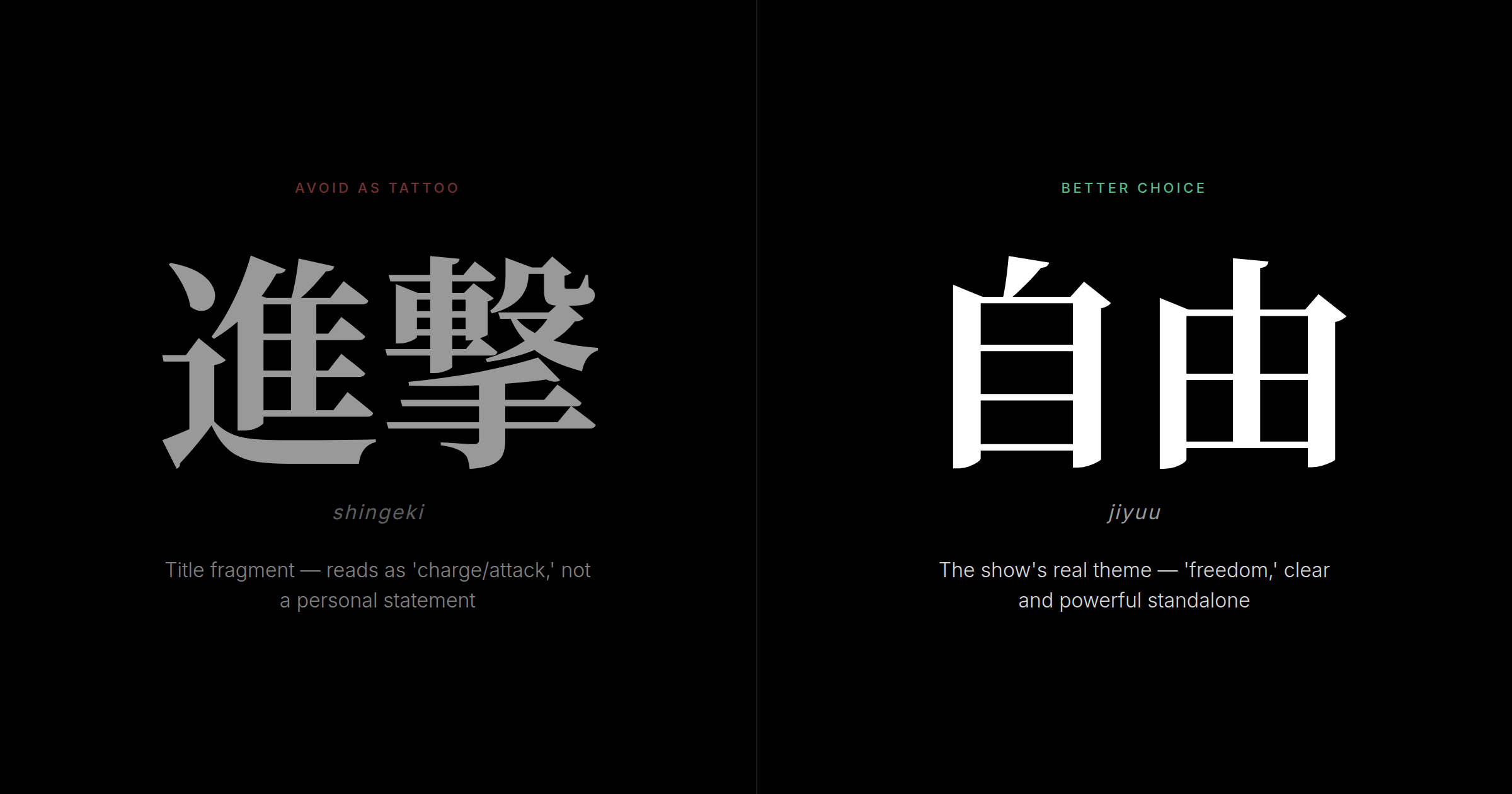
Some fans consider tattooing 進撃 (shingeki — advance, charge), the first word of the Japanese title. But 進撃 is not a stand-alone concept; it reads as a military term, not a philosophy. Without the full show title, it reads as a fragment — like tattooing "Attack" alone. It does not carry the show's meaning. 自由 does.
FAQ
What's the difference between 自由 (Jiyuu) and 戦え (Tatakae) for an Attack on Titan kanji tattoo?
自由 (freedom) is a philosophical statement with universal legibility — it literally means "from oneself," encapsulating personal agency without requiring anime context. It is the concept the Survey Corps fights for. 戦え (fight!) is the imperative verb form and Eren's personal mantra: a direct command to keep going when everything resists you. 自由 works standalone and is easier to explain to anyone; 戦え reads as a motivational command and resonates most with dedicated fans. Choose 自由 for philosophical depth and broader appeal, 戦え for emotional directness and fan connection.
Will Japanese people think I'm being disrespectful by getting a kanji tattoo?
Not if the strokes are correct and you understand what you're wearing. In Japan, kanji tattoos are still relatively uncommon among the general population — and some older associations with organized crime persist — but a properly executed 自由 or 戦え on a foreigner reads as cultural interest, not appropriation or disrespect. The key threshold is accuracy: a malformed character is more jarring than the concept of a kanji tattoo. Getting the meaning right matters; getting the strokes right matters more.
Should I get the full phrase 自由の翼 (Wings of Freedom) or just 自由?
Just 自由 is the stronger choice for most wearers. The full phrase — 自由の翼 (jiyuu no tsubasa), four characters counting the particle の — reads more like a title or motto and is harder to render at small tattoo scales without losing stroke clarity. 自由 alone is clean, versatile, and philosophically complete. If you want the visual reference to the Wings emblem, pair the 自由 kanji with the scout wings imagery rather than stretching the kanji phrase across a longer design.
Can I combine kanji with the Wings of Freedom emblem design?
Absolutely, and it is one of the most visually coherent Attack on Titan tattoo combinations. 自由 + the survey corps wings emblem balances linguistic meaning with symbolic reference — each element does different work. The kanji carries the philosophical statement; the emblem carries the fan reference. This combination works especially well because the wings emblem visually represents exactly what 自由 says in text. Pairing 戦え with complex imagery is harder to balance; that character reads better as a clean standalone or with minimal visual accents.
What's the minimum size for a kanji tattoo to stay readable over time?
At least two by three inches per character is the practical minimum for clean stroke retention. Kanji strokes are precise, and smaller renderings blur as skin ages. Go larger when in doubt — kanji rewards scale.
How do I find a tattoo artist who can render kanji accurately?
Look for artists with a documented kanji portfolio and a process for verifying accuracy against native references. Avoid shops where kanji is occasional work. The stroke integrity of 自由 and especially 戦え requires an artist who understands each stroke's weight, sequence, and termination.
Before you finalize your Attack on Titan kanji design, bring it to Kanji Ink Oracle for native review. Tokyo-based reviewers verify stroke accuracy and cultural register — so what lands on your skin is exactly what you intend it to say.